
Histogram overlay controls allow you to normalize overlaid histograms and space them out by a continuous offset.
Overview of Overlay Controls
Figure 1 shows the histogram overlay controls available to you. Plot resolution is controlled by the dropdown in Figure 1.1. Larger numbers produce higher resolution. Coloring and transparency of an individual sample is controlled via the Foreground Color selection box, Figure 1.2. To activate this box, double click on the plot to select the whole plot, and then single click on an individual sample in the legend. You will see the color box fill in with the color of the selected sample. Whether to smooth the histogram or not is controlled by the checkbox shown in Figure 1.3. Normalization is set via the dropdown in Figure 1.4, and the offset distance is controlled by the slider in Figure 1.5.
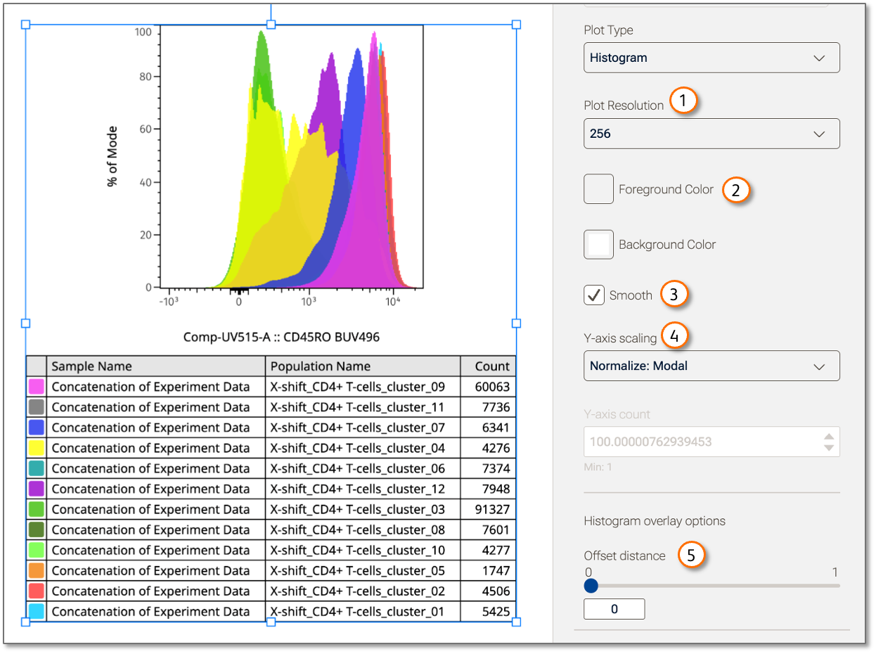
Figure 1 Overlay Controls
| No. | Component |
|---|---|
| 1 | Resolution control |
| 2 | Color and transparency control |
| 3 | Smoothing check box |
| 4 | Normalization selector |
| 5 | Offset slider |
Color and Transparency
To adjust any layer of a histogram overlay, first double-click the overall plot to select it, then click the item in the legend that you want to edit. The Foreground color button shown in Figure 1.2 can be clicked to bring up a color picker. To change the color, select another region of the color picker. To change the opacity, use the opacity slider to adjust the layer to the transparency of your choosing. Figure 2(a) shows the pink population selected with full opacity. Figure 2(b) shows the impact of moving the color selector to gray and decreasing the opacity.
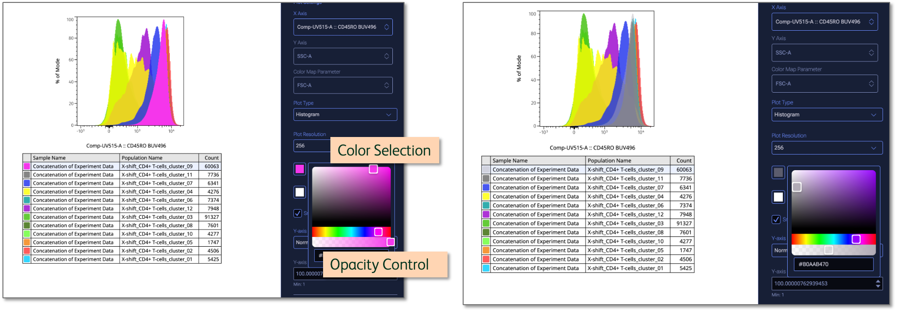
(a) (b)
Figure 2 Color and Opacity Control
Smoothing
Figure 1.3 shows the smoothing checkbox. When checked, a moving average filter is applied to the data, smoothing out some of the noise in the data. Smoothing is useful as small variations in the data such as a cell being placed in one bin versus the one next to it are within the range of error measurement, meaning that representing the data as a smoother curve is just as accurate and easier to interpret.
Normalization Options
Normalization is a means of improving the ability to compare data by adjusting the values to be a ratio to a common reference. It is useful to normalize histograms if they come from parents with differing numbers of events, making the raw number of cells not particularly meaningful. There are a pair of normalization options in FlowJo which can be selected from the dropdown shown in Figure 1.4.
The four options for normalizing FlowJo histograms are:
- Auto (no normalization): The Y-axis will be Count and the range will be automatically set. This is a good option when you are creating a single histogram and all of the populations come from a common parent, so a difference in count is meaningful. This would also apply to a set of populations with different parents if the number of events in all parent populations has been made equal by sampling.
- Manual (no normalization): Similar to Auto, except you specify what the range will be. This is a good option if you want to compare a histogram to one that you previously created and want the axes to be the same, even if it produces a sub-optimal scaling for the plot you are working on. Sometimes small, difficult to see peaks are exactly the graphic you need to make a point!
- Modal: Each sample will be normalized to its own largest peak so that the maximum value for all samples is 100%. This is a good option for comparing samples with very different numbers of events or from differing parent populations, when the primary concern is the distribution of the data.
- Unit Area: Similar to modal normalization, each sample is normalized to is own area so that the area of each is equal to 1. The primary advantage of this method over modal is that it preserves the shape of the distribution. Modal normalization will disproportionately impact smaller peaks. Unit area is the best choice, technically, though readers and reviewers tend to find modal normalization easier to understand.
Histogram Offset Distance
Histograms can be spaced out vertically using the slider in Figure 1.5. Moving the slider from left to right (or typing a number into the data entry box below) increases the spacing between histograms. 0 represents an overlay. The maximum value is 1, which represents the distance at which the histograms do not overlap at all.
Movie showing the adjustment of offset distance