
Cluster Explorer provides an interactive environment for exploring, validating, and exporting clustering results applied to cytometry data. Use it to visualize cluster assignments across dimensions, examine cluster composition, compare clustering algorithms and parameters, and export per-cluster median fluorescent intensities. FlowJo v11’s Cluster Explorer improves on previous versions via tighter integration with the overall FlowJo toolset and increased flexibility.
Accessing Cluster Explorer
As shown in Figure 1, the Cluster Explorer is accessed from the Navigation Bar and immediately applied to the selected population.
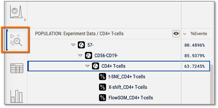
Figure 1 Accessing the Cluster Explorer from the Context Pane
"Cluster" Explorer works on any population
Though we've maintained the name Cluster Explorer, it's really a Population Explorer; you can click on any population that has sub-populations that were created using any method and apply the tools of the Explorer. IMPORTANT: The Cluster Explorer shows the child populations of whatever you select.
This will feel natural for clustering results as you will apply a clustering algorithm to a population and the clusters will be created as children of that population. In the example below CD4+ T-cells is selected, and the children of that population, the FlowSOM produced clusters, are what appear in the Explorer.
For information on how to create clusters, see the X-Shift or FlowSOM pages.
For more information on creating dimensionality reduction parameters see the tSNE or UMAP pages.
Components of the Cluster Explorer
Like all of FlowJo, the Cluster is Explorer population selection is driven by the hierarchy. In Figure 2.1 the selected population, CD4+ T-cells is selected and thus the Explorer is showing all of the child populations of CD4+ T-cells. In this example (Figure 2), those populations are all of the clusters produced by the FlowSOM and X-Shift algorithms.
Virtually concatenated population (VCP) mode is useful here as it allows you to toggle between showing all of the samples in the currently selected group concatenated together, or not. In the example below (Figure 2), note that the VCP icon is toggled ON in the samples pane, so the plots represent the concatenation of all 9 files.
Groups are also useful here (as they are are everywhere in FlowJo!). In this example, Experiment Data is selected, so all 9 files in that group are displayed. If you make child groups that divide the data by condition, for example, you can select a child group to display only the data for that condition, and toggle quickly between conditions.
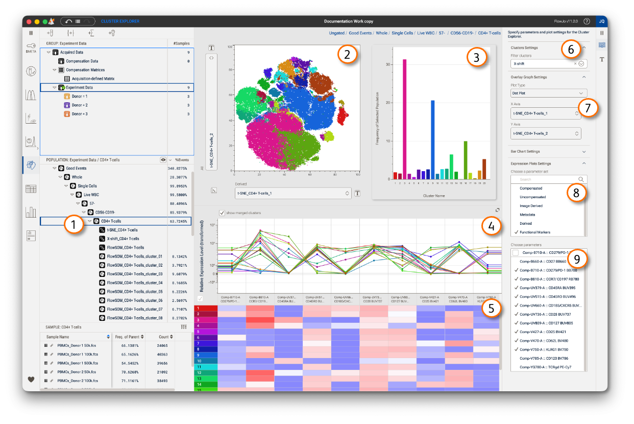 Figure 2 Components of the Cluster Explorer
| No. | Component |
|---|---|
| 1 | Selected population |
| 2 | Overlay of all child populations |
| 3 | Bar chart of all child populations |
| 4 | Line chart of all child populations |
| 5 | Heat map of all child populations |
| 6 | Population filter control |
| 7 | Overlay plot controls |
| 8 | Parameter set filter |
| 9 | Parameter selector |
Filtering
You can filter which populations are displayed at any time using the Filter Clusters option shown in Figure 2.6 by either typing a value into the box, causing the Explorer to display only populations that contain the text you entered, or by selecting one of the pre-defined options from the dropdown menu. In this example, X-Shift has been selected causing the Explorer to only show populations that contain X-Shift in their name, thus filtering the displays to the X-Shift cluster results.
Graphs
Overlay: A dot plot of all filtered clusters will, by default, be shown on any detected dimensionality reduction parameters (e.g. tSNE, UMAP). You can choose to display other parameters via the dropdowns on the plot axes or in the Properties panel (Figure 2.7). Selecting one or more clusters in the Heat Map will filter the display of the Overlay plot, and all graphs.
Bar Graph: The bars illustrate the relative frequency of each cluster, as compared to the selected parent population. In this example, the percent of CD4+ T-cells of each cluster is shown. Bar graph controls are available in the Properties panel (collapsed in Figure 2, below the overlay controls).
Line Plot: Each dot on the line plot indicates the median fluorescent intensity (MFI) of one cluster for one parameter. The data points for each cluster are connected with a line and colored to match the rest of the plots. NOTE: The vertical axis in this plot is the consensus transform, an axis transform that shows the calculated MFI for all clusters on a common scale, selected to be broad enough to display all data points and allow direct parameter-to-parameter comparison. If you have parameters that you have individually scaled to have a much smaller range than the consensus, they will look less bright on this plot than in the graph window.
Heat Map: Each column is a parameter that aligns with the line plot, and each row is a cluster. The boxes formed by the intersection are colored to reflect the MFI of the cluster for that parameter. The color range is determined by using the full range of the consensus transform, so boxes colored red indicate populations near the high end of the consensus range, and boxes colored blue, the low end. You can click on any cluster in this plot to highlight it across all plots. Multi-select works as well, as shown in Figure 3, in which clusters 3 and 10 have been selected. To reset the plots to show all clusters, check the 'Show All' box, indicated with an arrow in Figure 3.
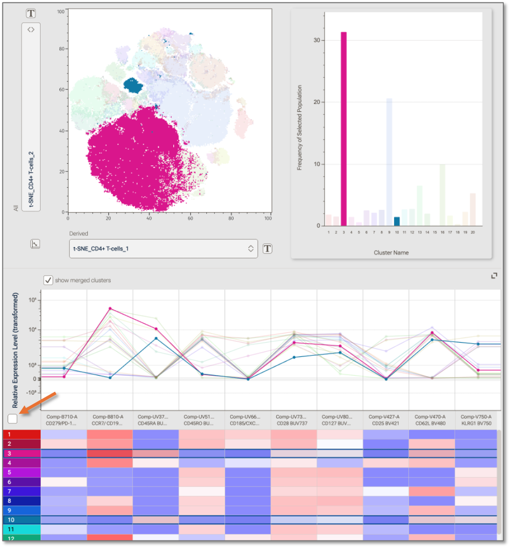
Figure 3 Clusters selected in the heat map are highlighted on all plots
Parameter selection for the line plot and the heat map is done uniformly via the Parameter Set filter and Parameter selector, Figure 2.8 and 2.9 respectively.
Merging Clusters
Contents of the Cluster Explorer are controlled via the hierarchy, so adding, deleting, or renaming a child population of the currently selected population will affect the display. Additionally, the Cluster Explorer will recognize that a Boolean OR gate of two clusters (Figure 4.1) is the merge of two clusters and will automatically replace the two clusters with a single merged version in all plots, if the Show Merged Clusters (Figure 4.2) box is checked, which is the default condition. Unchecking the box will maintain the Boolean population without displaying it, thus, showing the original clusters.
Display Controls
The Cluster explorer window can be configured, as needed. The collapse icon (Figure 4.3) will collapse the overlay and bar chart and dedicate the Discovery panel to the line plot and heat map, useful if you have many clusters. For finer control, slide the divider up or down. The divider will highlight when selected, as shown in Figure 4.
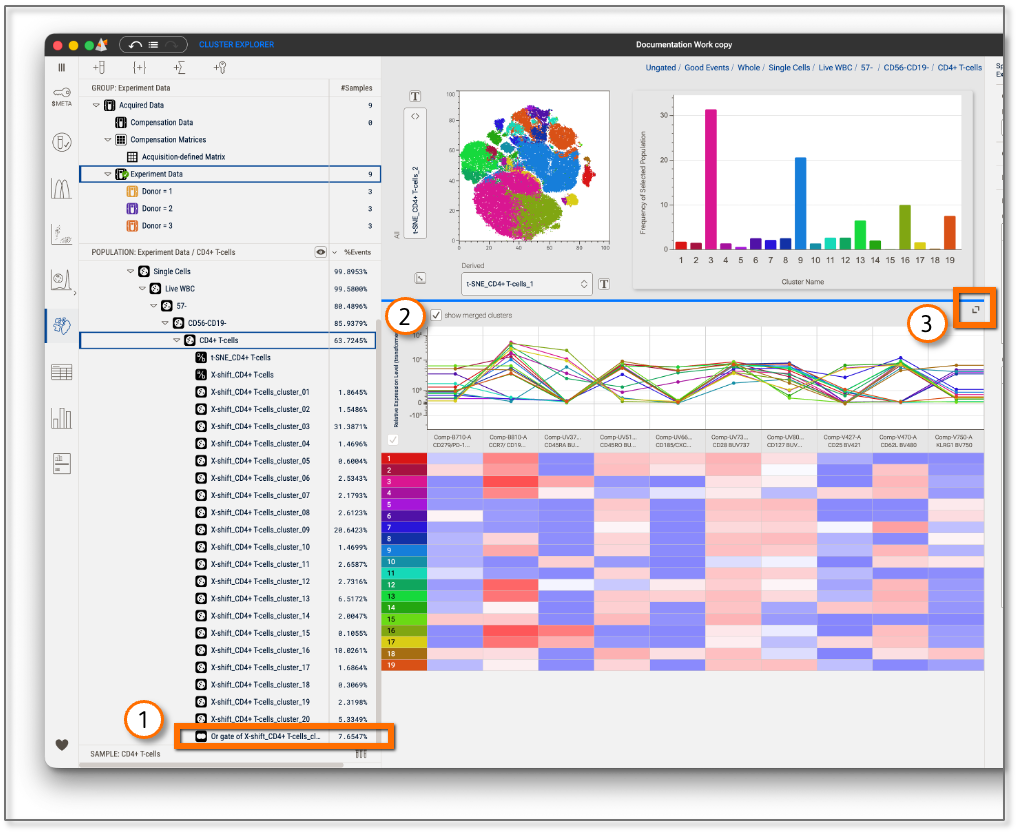
Figure 4 Display Controls
| No. | Element |
|---|---|
| 1 | Boolean population |
| 2 | Show merged clusters |
| 3 | Collapse icon |
Statistical Comparison
For a statistical analysis of clustering results, add them to a Table, create a Chart, and produce statistical comparisons between categories in your experiment!