
Sample Quality Control (QC) is crucial in data analysis.
Despite all care during samples preparation and instrument setup, issues can arise when running the acquisition on the instrument (i.e. most common ones are clogs and air bubbles). Those issues may result in the alteration of the measurement of the parameters which can lead to false discovery.
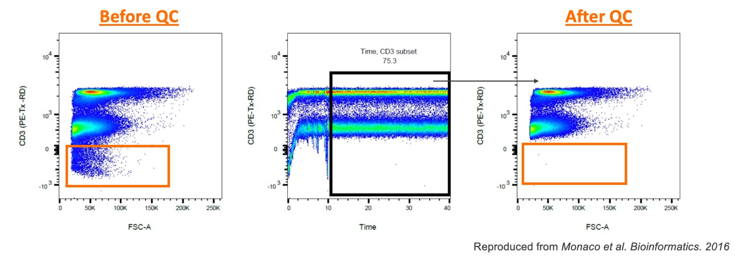
Figure 1. Importance of running QC on samples
There are many great R based algorithms available, but FlowJoTM Version 11 has its own integrated QC tool. In the navigation bar, click on the “Quality control” icon (Figure 2.1). Select the parameters that will be checked (Figure 2.2) and adjust quality control settings in the “Properties panel” (Figure 2.3, 2.4, 2.5). Information regarding each setting can be found below.
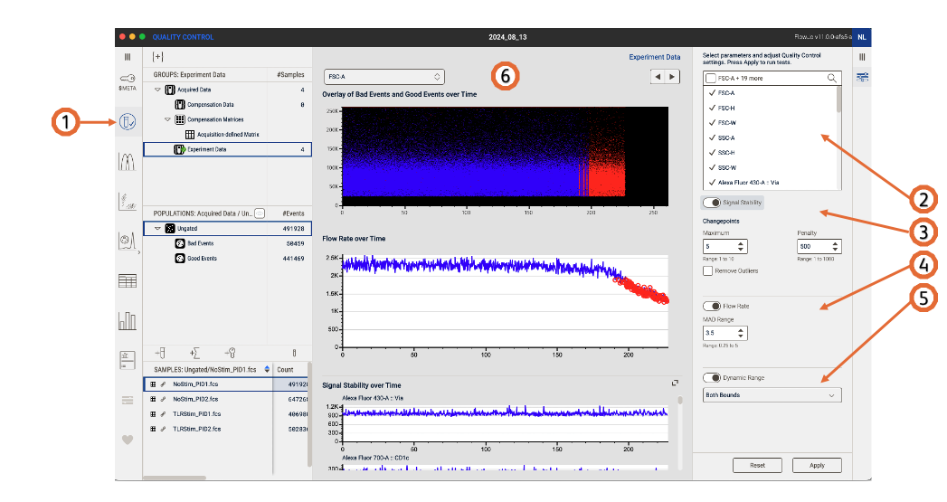
Figure 2. Sample quality control (QC)
Signal stability
- Changepoints maximum: the maximum number of change points that can be detected for each channel.
- Changepoints penalty: raise the penalty value to be less strict in the anomalies detection.
Flow rate
MAD range: shows deviations from the peak range, lower the value to be more strict (Default 3.5 – Range 0.25 to 5).
Dynamic range
Select whether the dynamic range check should be performed on the upper limit, the lower limit, or both.
On completion
After running QC on your data, a green check mark will be on displayed on the group “Experiment Data”, a set of Good Events/Bad Events populations will be created and displayed in the Populations panel (Figure 3). 
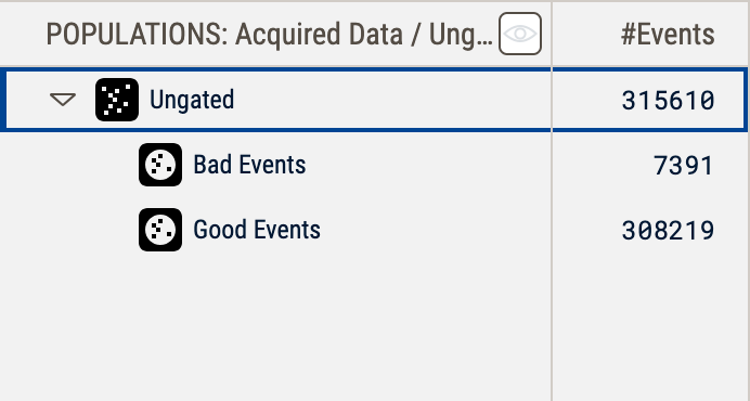
Figure 3. Green check mark after performing QC. Bad Events and Good Events populations are now shown in the populations panel.
A full QC report will be displayed in the Discovery panel. The Overlay shows Bad Events and Good events vs Time plot, where blue are the Good events and red are the events removed after QC (Bad Events). You can also chose to display a parameter of your choice on the Y axis (Figure 4).
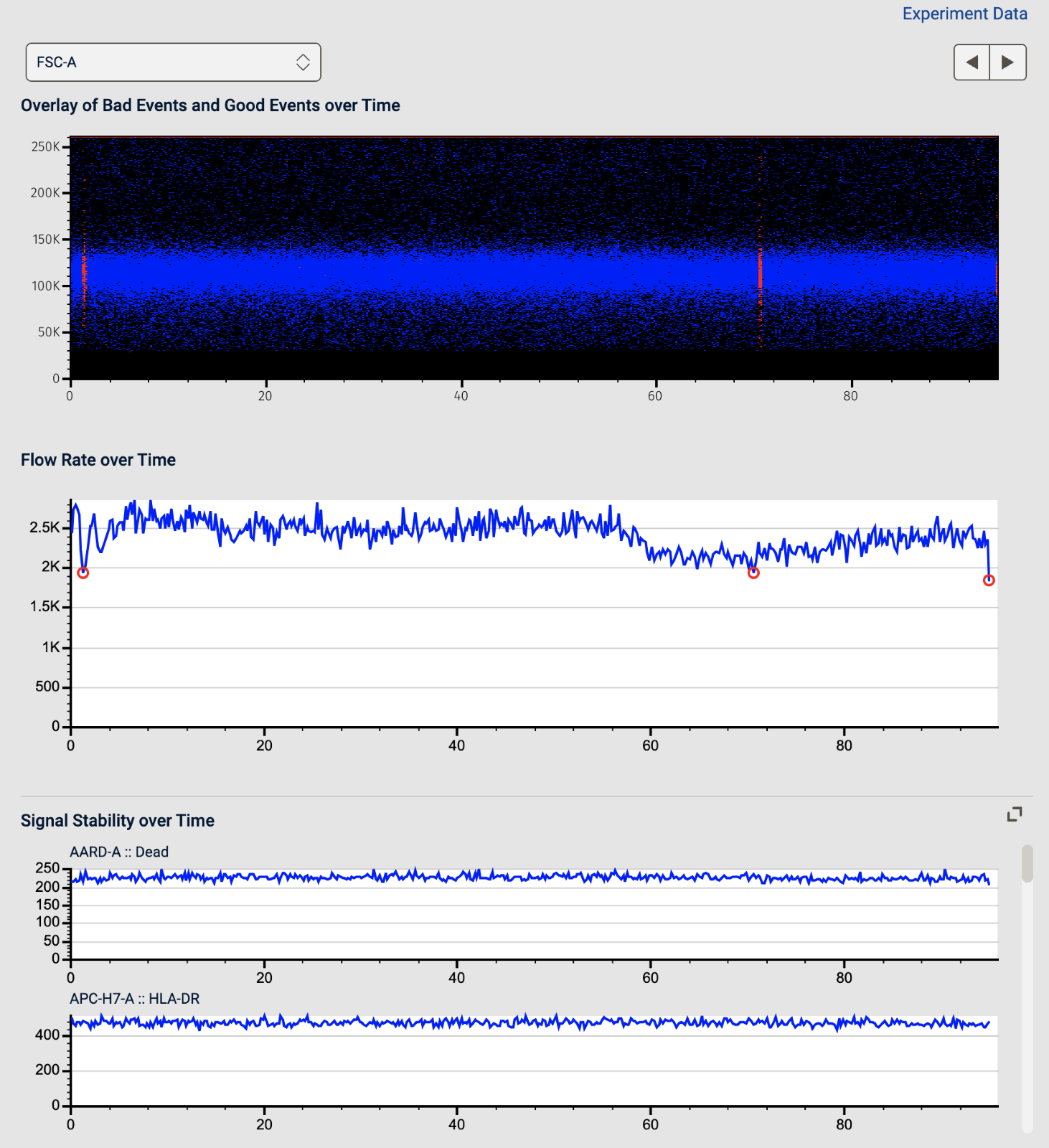
Figure 4. QC Report