
Charts help visualize data from tables.
After creating a table, the charts tool can be used to create a visualization of that table that tells the data story in a visual, easy to interpret manner.
Overview
Chart creation is accessed from the Chart tool in the Navigation Bar (Figure 1).

Figure 1. Creating a chart
The steps to create a chart are:
Select an existing table from your FlowJoTM workbench to use as the source data from the Chart definition property in the properties panel. See the Table creation page for information on how to create a table. Choose the Management properties to create, duplicate, or delete a chart (Figure 2a).
Use the Settings properties to specify any formatting of the chart (Figure 2b)
Choose the Definition properties to specify which populations and statistics to include in the chart as well as the orientation (Figure 2c).
Use the Comparison properties to specify parameters of statistical analysis (Figure 2d)
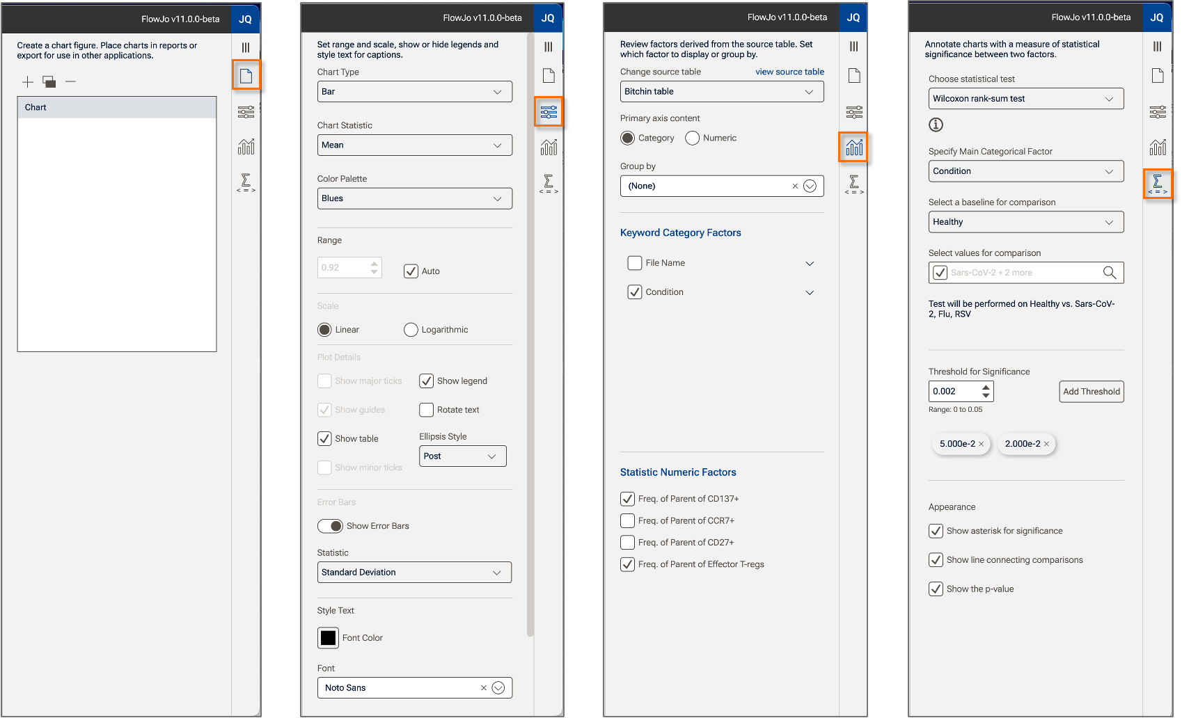
(a) (b) (c) (d)
Figure 2. Chart properties: (a) Manage properties; (b) Settings properties; (c) Definition properties; (d) Comparisons properties.
Charts are dynamic, all changes immediately cause the chart to update, including gate adjustments, and adding or subtracting categories or numeric factors.
Adding Charts to Reports
A chart can be added to a report in two ways:
- Right-clicking on a chart and selecting Copy, then pasting into the report of your choice.
- Inserting it from the Assets panel in Reports
Additional tools for building and modify charts are discussed in: