
Expand or compress data on a graph to enhance visual separation of populations.
Ever have “cells” (events) pile up on the x or y axis? Or samples with only slight differences in brightness that need to be emphasized? Data visualization is key to accurately gating different populations and interpreting biological patterns of marker expression. Transforms help with this by modifying the visual space that is allotted to various regions of the data but do not change your actual recorded fluorescence data.
Select, preview, and apply modifications to parameters in the Transforms property (Figure 1).
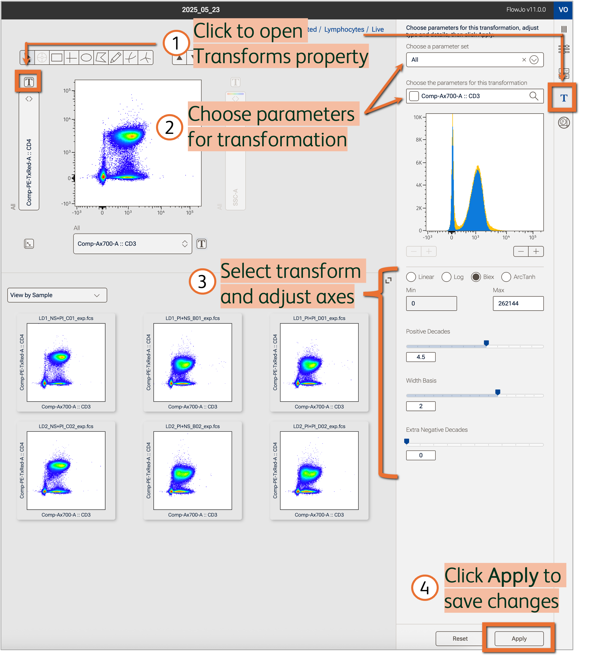
Figure 1. Adjust scaling and visualization space in the Transforms property
Open the Transforms property
Modify the transformation of either parameter displayed in the Primary plot by clicking the T button beside the respective axis (Figure 1). Alternatively, navigate to Transforms in the Properties panel then choose the parameters to be modified (quickly modify multiple parameters at once using parameter sets!).
Use the histogram to preview transformation changes (detailed in paragraphs below). The blue shading reflects the gated population currently displayed in the Primary plot while the yellow shading reflects the full ungated data of the same single sample. If VCP (virtually concatenated populations) is turned on, the histograms will represent all samples but still preserve the color scheme of blue for the gated population and yellow for full ungated data.
Choose a transformation type
Select one of various transformation types to apply to the selected parameters. The appropriate transformation type will depend on the type of parameter (scatter, fluorescent, imaging) and your application (see example in Figure 2).
- Linear: Equal intervals along the scale. This is standard for scatter parameters and often used in specialized assays, like cell cycle analysis, where fluorescent differences between populations are smaller. However, linear scales typically fail to capture the full dynamic range of flow cytometers.
- Log: Data is scaled by base 10 log to better visualize a large range of values. Log scaling may be appropriate for data with a large range of values or collected on an analog cytometer. Because we cannot take the log of a negative number, this transform cannot accommodate negative data values, which are possible with modern digital cytometers. As such, hyperbolic functions that handle both negative values and large dynamic range are favored for scaling flow cytometry data.
- Biex: The hyperbolic default display transformation process is called Biex and is based on a method that uses a generalization of the bi-exponential function1,2. The display functions approach true log for high data values and approach true linear around zero. This provides smooth, near-linear display of low and negative data values while capturing the full range of higher values.
- ArcTanh: The hyperbolic arc tangent (ArcTanh) transform also passes data through functions that create a linear-like scale near zero and a log-like scale beyond an adjustable threshold. The equation-based nature of this transform makes it possible to create exact replicas of these transforms in other software, such as R, and can optimize scaling of imaging parameters.
![]()
Figure 2. Different transforms applied to the same data
Adjust transformation details
Set the minimum and maximum value of the axis for linear and log scales.
For Biex scales, a maximum value can be set. Sliders are available to modify the visualization space. The top slider controls the size of the positive decade space. The bottom slider controls the number of extra negative decades. Use these toggles to bring values on scale or remove unused white space in the graph. The width basis slider controls the size of the linear scale beginning at zero, which can be helpful to compress low value populations that spread widely around 0 (Figure 1).
In the example below, default Biex scaling of the CD3 and CD4 parameters made the populations appear compressed (Figure 3). Decreasing the maximum value on the axis by 1 log for both parameters, and adjusting the positive and negative decade space expanded the space occupied by the high value data, making populations appear much more distinct in the resultant plot.
![]()
Figure 3. Visualization space after adjusting axes of biexponential scale
References
- Herzenberg LA, Tung J, Moore WA, Herzenberg LA, Parks DR. Interpreting flow cytometry data: a guide for the perplexed. Nat Immunol. 2006 Jul;7(7):681-5.
- James W. Tung, Kartoosh Heydari, Rabin Tirouvanziam, Bita Sahaf, David R. Parks, Leonard A. Herzenberg, Leonore A. Herzenberg. Modern Flow Cytometry: A Practical Approach. Clinics in Laboratory Medicine, Volume 27, Issue 3, Pages 453-468.