
Customize your data display with various plot types and color palettes.
Data display can have a big impact on gate placement and overall biological representation. In flow cytometry, some plot types more accurately display the distribution of expression patterns when dealing with a very low or very high number of cells on the plot (learn more in REF 1). You can also be strategic in color choice to emphasize trends in the data by modifying how your data is displayed in the Graph settings.
Select plot type
Navigate to Settings in the Graph properties panel and select a plot type in the dropdown menu (Figure 1). Which plot type should I use? Some plot types have more value over others depending on the size and complexity of the data in the graph (Figure 2).
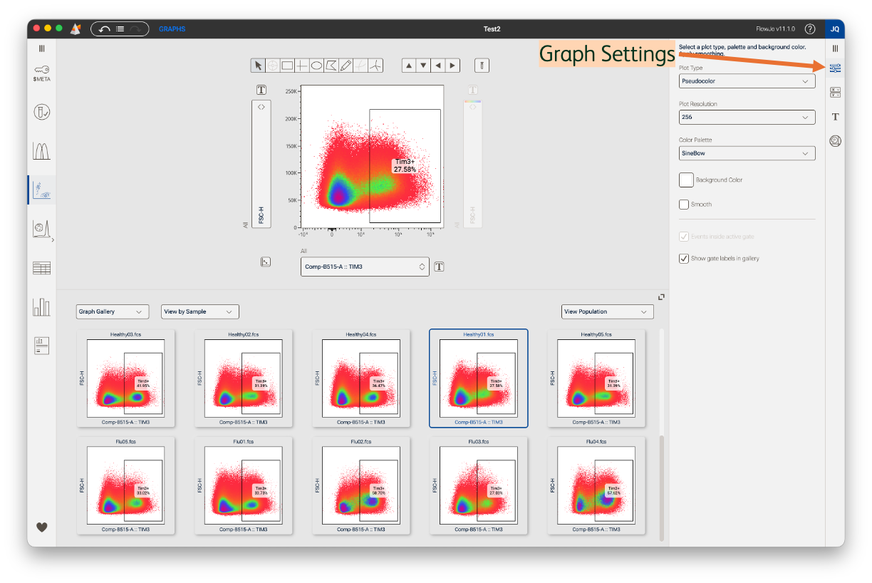
Figure 1. Graph settings
Pseudocolor: These plots are one of the most popular data display options in flow cytometry because they give us two important pieces of information. First, the color density reveals changes in the relative number of cells localized on a region of a biaxial plot. This helps us identify the boundary of distinct populations on the plot. Second, the number of events in the population is easily gauged by the number of dots on the graph. Color density visualizations are less helpful in plots with very few events.
Contour: Rather than use color density, contour plots reveal data distribution through contours or gradient lines. Each line encloses an equal percentage of events and closely packed contour lines indicate a high concentration of events. Use the Levels slide bar to change the number of lines used to define the gradients. Currently, outlier events outside contours are not displayed. Contour plots are much less sensitive to event number and so are favored for gating on infrequent populations that would be hard to distinguish on a dot or pseudocolor plot.
Dot: This is a classic plot type and well-suited for moderate event numbers. Like a pseudocolor plot, you can easily gauge event number on the plot. However, dot plots are harder to use when gating sparse or densely packed populations because there is no color gradient or contour pattern to identify population boundaries.
Heatmap Statistic: In this type of plot, a statistical value (e.g., MFI) for a third parameter is displayed on cells in the current biaxial view. After selecting Heatmap Statistic as a plot type, use the dropdown axis menu to the right of the Primary plot to select which third parameter to display. In the example below, events on the Heatmap statistic plot are plotted based on their CD3 and CD4 expression, but each event is colored to display its magnitude of expression for CD38 (Figure 2, last plot on the right). Here, it’s clear that most cells with high CD38 expression (red-yellow coloring) are outside of the CD4 T cell gate. Thus, this plot offers additional biological insights over a typical biaxial plot, which will be helpful for simplifying data presentation or validating gate placement.
Note on color range: the displayed color range is linked to the scaling range of the selected color map axis parameter, set in the Transforms property. Maximizing visual separation of expression patterns (i.e. minimizing white space), will increase the color range to emphasize differences in events that are low or high for a third parameter statistic.
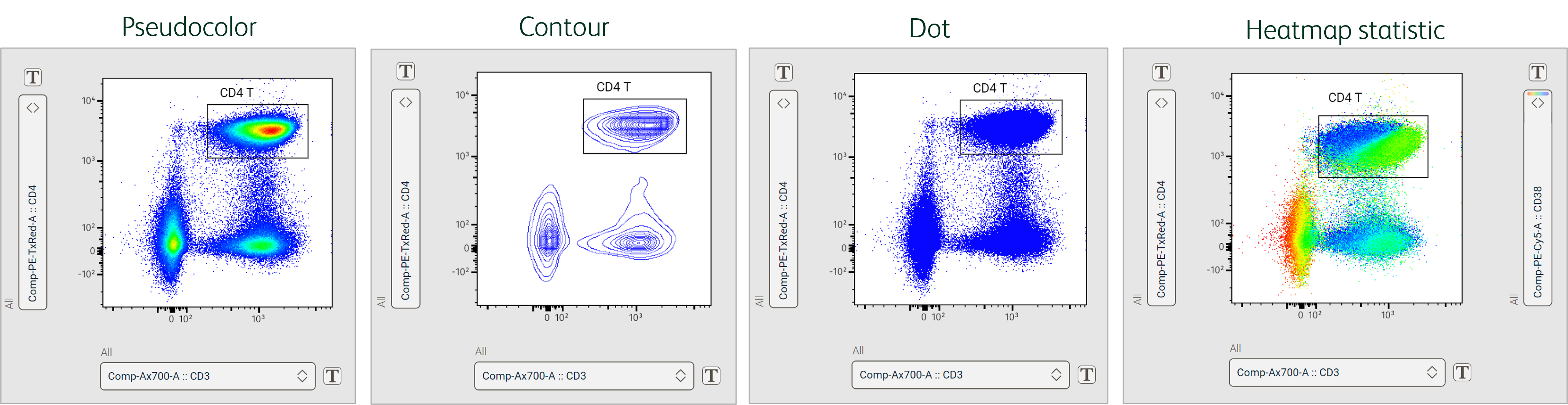
Figure 2. Biaxial plot types
Histogram: These plots display the frequency distribution of your flow data, one parameter at a time; select this parameter on the x-axis dropdown (Figure 3). Data on the x-axis is divided into 256 bins. The y-axis for histograms is the number of cells/events falling within each bin of the histogram.
Histogram plots offer a simple display of data and are often used to gate populations in a cell cycle or proliferation assay. However, univariate representations can sometimes mask autofluorescence from a fluorescent parameter not seen in the plot (see REF 2), so use histograms with caution for gating and, if possible, consider using them only to display differences in expression patterns between populations or samples.
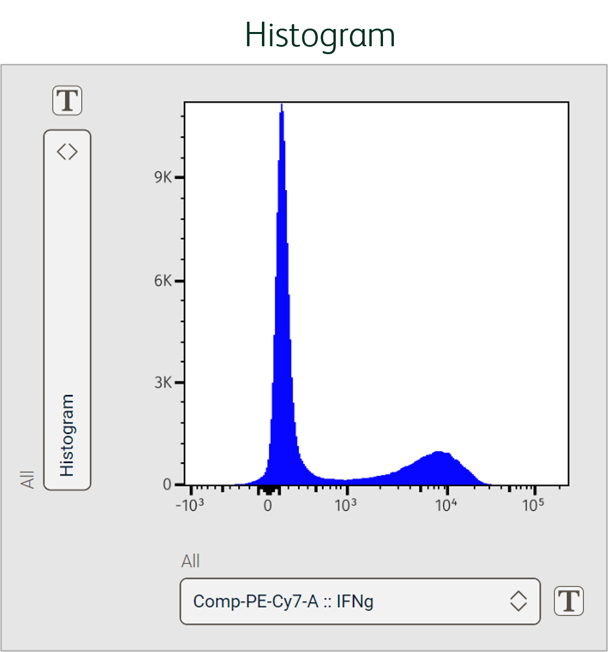
Figure 3 Histogram plot type
Plot Resolution
Plot resolution can be adjusted from this menu. The options are 128, 256, 512, and 1024 dpi. The default is 256. The lower the resolution the better rare cells will be visible and the quicker rendering will occur. Higher resolutions generally look more visually appealing
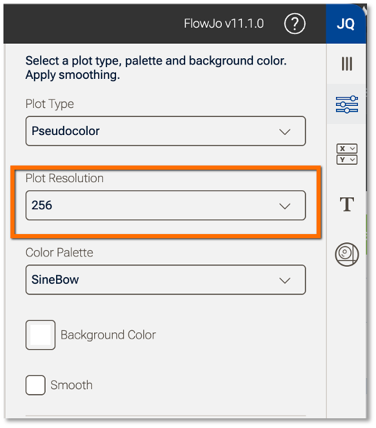
Figure 4 Plot resolution control
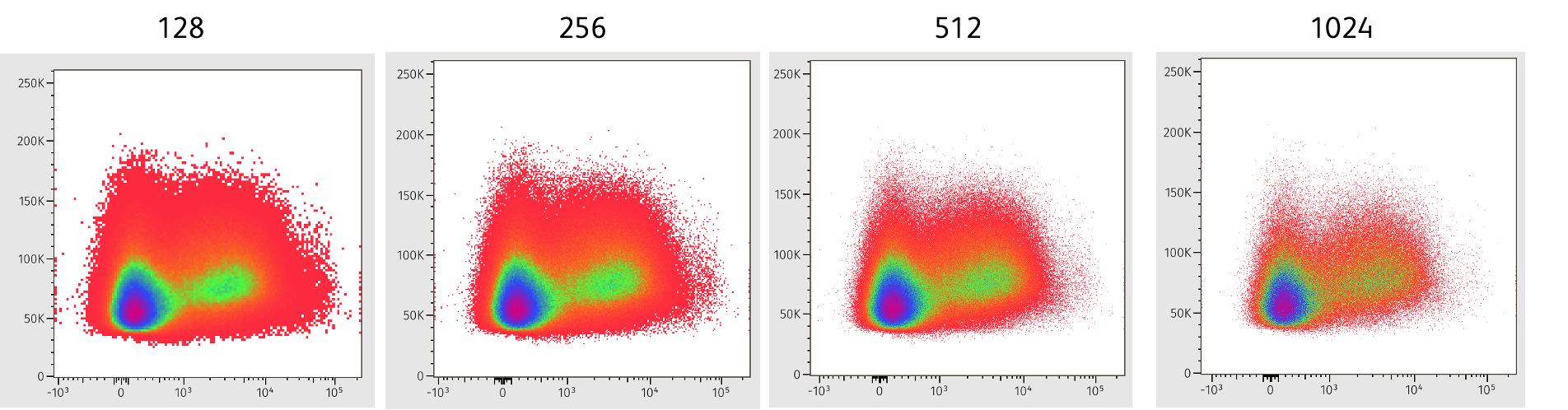
Figure 5 Increasing resolution
Select colors and smoothing
FlowJoTM Version 11 has more color density options than ever before (Figure 6)! For pseudocolor and heatmap statistic plot types, select the classic rainbow palette or one of 15 other options in the Color Palette dropdown menu.
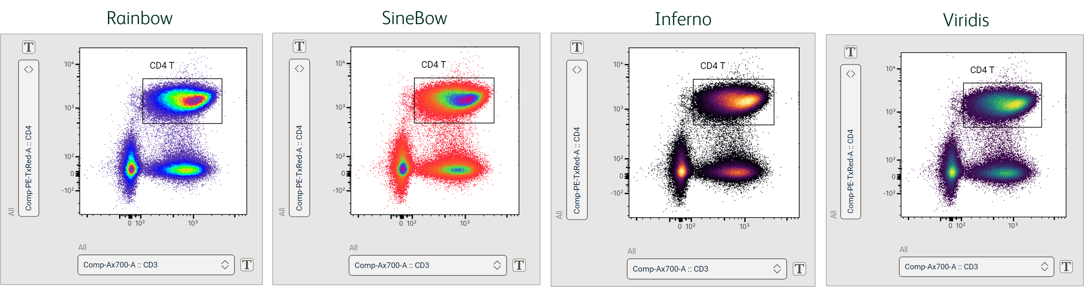
Figure 6 Color palette examples
All other plots that display data in a single color (i.e. no color density), can have the events colored with one of over 100 color options. Click the Event Color box to reveal the selection palette (Figure 7).
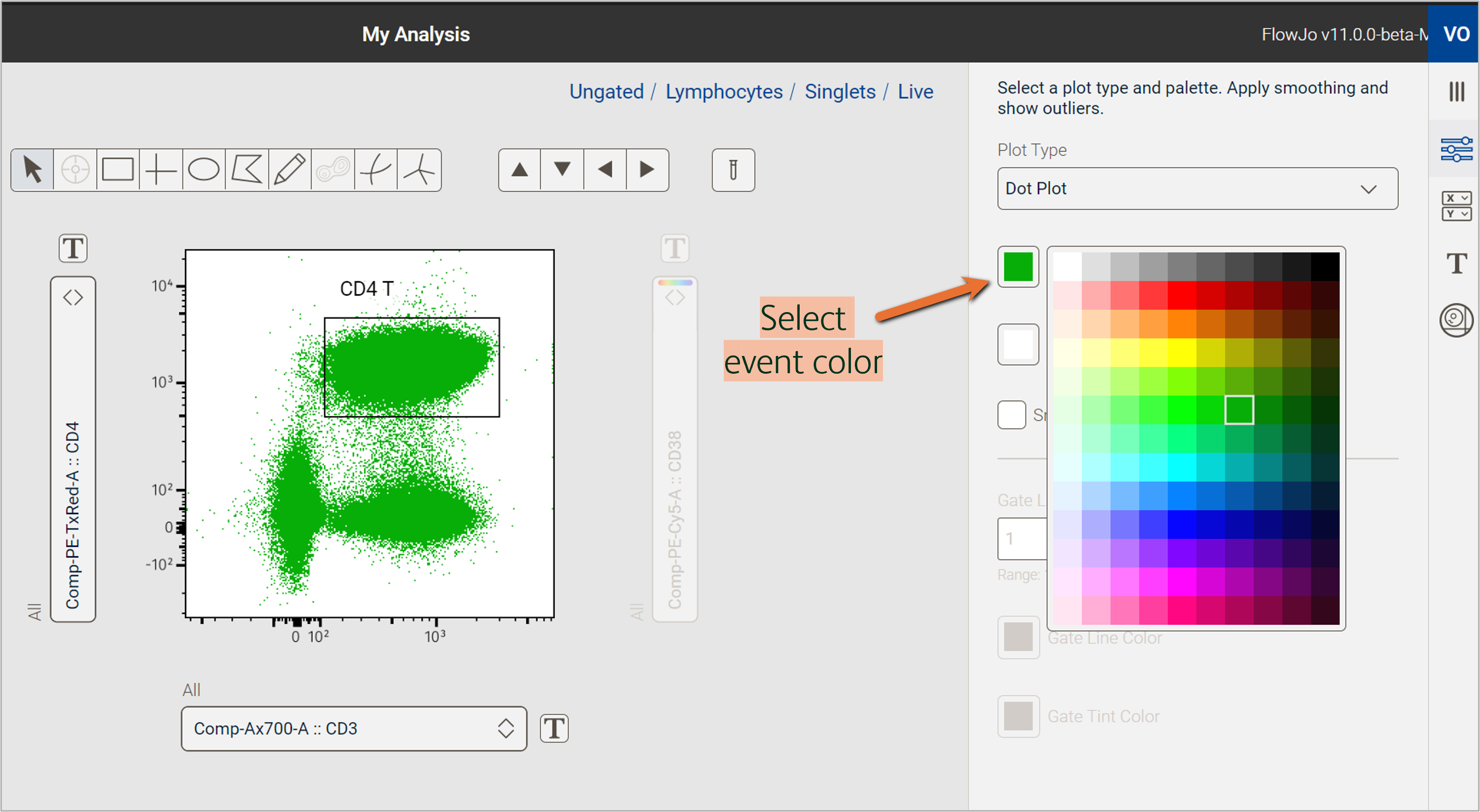
Figure 7 Event color options
For any plot type, select a Background color for the graph (Figure 8). Darker backgrounds may be helpful for plotting lighter event colors… or reducing eye strain during long analysis days!
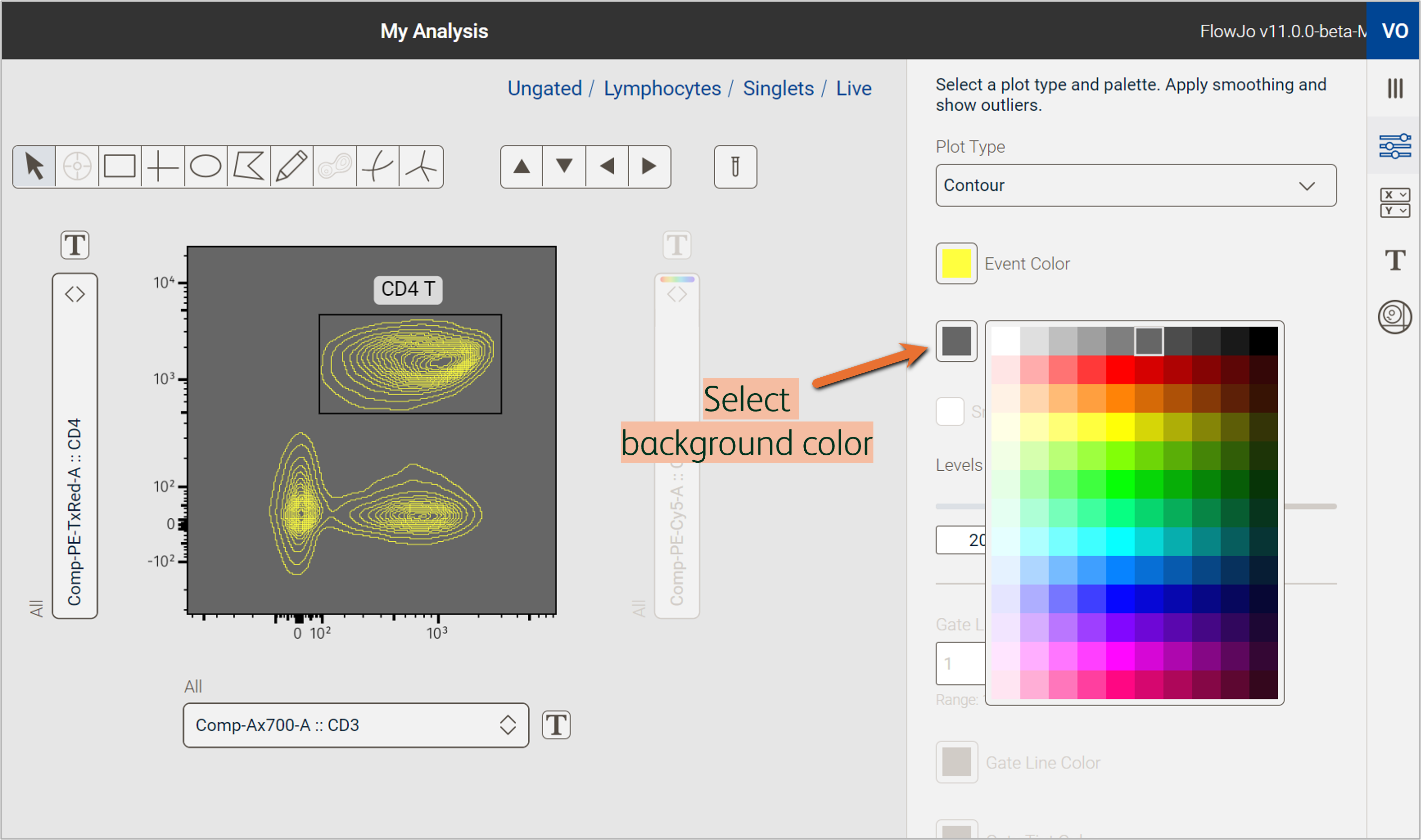
Figure 8 Background color options
Click the Smooth checkbox to remove outlier events and hide individual data points (Figure 9). This option is available for pseudocolor, dot, and histogram plot types.
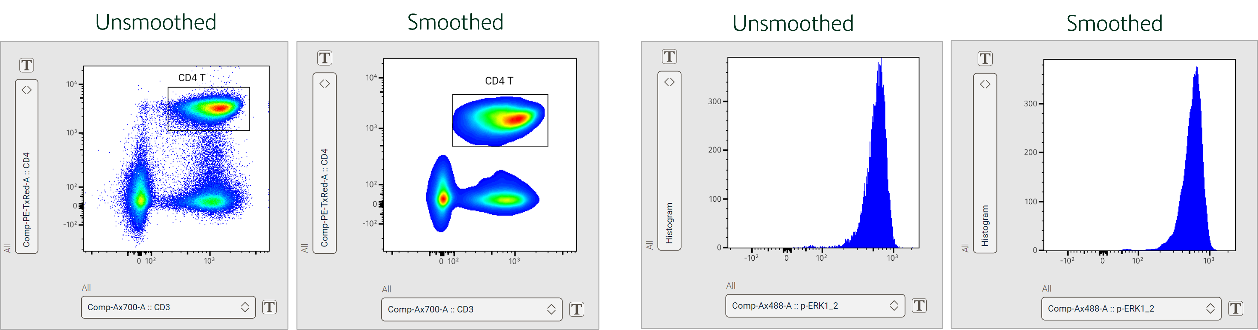
Figure 9 Effect of smoothing on plot types
References
- BD Biosciences. Data Display – Best practices for data analysis. https://youtu.be/GC1lzA9Yt9w?si=hkCH5yY3mvQIMrxB. January 2023.
- Bushnell, T. 4 Biggest Mistakes Scientists Make During Multicolor Flow Cytometry Cell Sorting Experiments. Cheeky Scientist. https://expert.cheekyscientist.com/biggest-mistakes-multicolor-flow-cytometry-cell-sorting-experiments/. Updated 2024. Accessed August 2024.