
Visualize all samples and parameters as well as ancestry in a single pane during your analysis.
While analyzing your samples, you may find yourself asking questions like: Do I need to adjust my upstream gates? How does this gate placement look on the rest of my samples? Is this marker co-expressed with anything else? To answer these, it may be helpful to briefly see your data summarized or plotted in different ways. Rather than change the data displayed in your Primary Plot, utilize the various shortcut visualizations in the Graph Gallery (Figure 1).
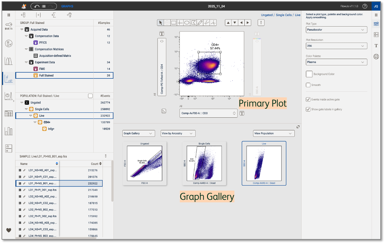
Figure 1. Graph gallery
Display data
Select Graphs in the Context navigation bar to launch plots in the Discovery panel (Figure 2.1). Next, click the group of samples in the Groups panel that you want to see in the Primary plot and Graph gallery (Figure 2.2). Use the dropdown menu in the Graph gallery to change the display to View by Sample, Parameter, or Ancestry (details in sections below) (Figure 2.3). Adjust the height of the gallery by dragging the gallery’s top border or enter a full screen view by clicking the icon on the top right of the Graph gallery. The Graph properties panel contains controls for customizing graph types and color palettes for both the Primary plot and Graph gallery.
Graphs in the gallery are interactive! Click any graph to quickly display it in the Primary plot above the gallery
There are three primary controls, as shown in Figure 2, that control what is displayed in the graph gallery. The controls are choices of:
- Plots Versus Images
- Gallery Plot Modes
- Population Selector
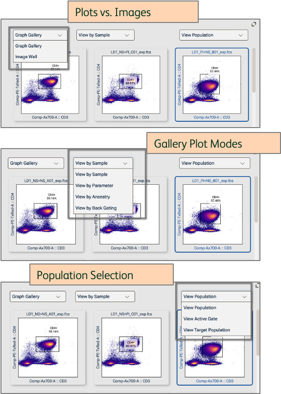
Figure 2. Display data in the Graph gallery
Plots Versus Images
Plots versus images controls whether a series of dot or histogram plots will be shown, or images if the data have associated images.
Gallery Plot Modes
View by Sample
This is the default view in the Graph gallery, whereby the graph seen in the Primary plot is shown for every sample in the selected group (Figure 3). In other words, each graph represents a different sample. Use this view to guide gate placement, navigate between samples for quick gate adjustments, or preview marker expression patterns across experimental conditions in your experiment.
In the example below, you can easily see that samples stimulated with PI have downregulated CD3 and CD4, so a gate adjustment on those plots will be needed.
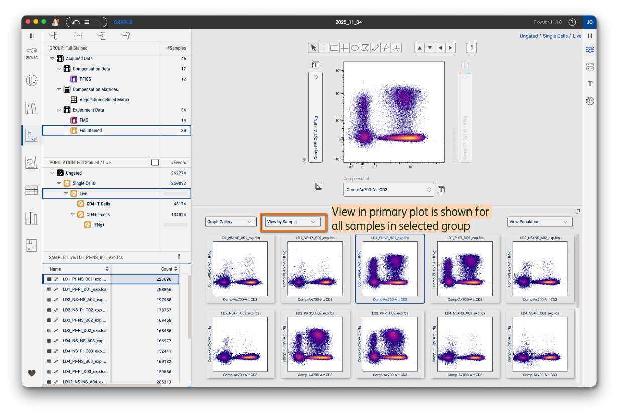
Figure 3. View by Sample
View by Parameter
This view will plot a single parameter against all other parameters in the experiment. In Figure 4 all data in the Graph gallery are from a single sample and population (both can be changed by making selections in the Samples panel and Population panel). One parameter will vary and the others will be kept constant across the gallery graphs. In the Primary plot below, CD3 is shown on the x-axis and CD4 on the y-axis. In the Graph gallery, selecting View By Parameter and Batch Z allows the x and y-axes to be held constant and the y-axis to iterate across all parameters in the parameter set currently selected for the z-axis. Any of the thee axes can be varied. If the x or y axis is selected to vary, the plotted parameters will cycle.
Use this view to preview combinatorial phenotypes. In the example below, I can see that CD4 T cells that are IFNg+ are largely negative for other surface activation markers in my panel, like CD38 and HLA-DR. This view can also be helpful for inspecting residual spillover after compensation in full-stain samples or single-stained controls.

Figure 4. View by Parameter
View by Ancestry
This view will show all gated plots upstream of a selected population in a single sample (Figure 5). The depth of the ancestry shown is dictated by the population selected in the Populations panel. In other words, selecting the final population node in your ancestry will reveal the entire upstream gating hierarchy while selecting the top population node will reveal no ancestry because there’s nothing upstream of it.
Use this to review gate placement in your hierarchy across samples or to quickly capture and share your gating strategy with collaborators.
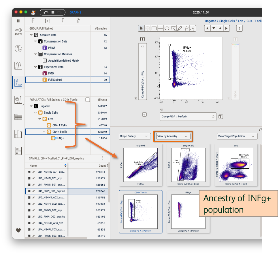
Figure 5. View by Ancestry
View by Backgating
Backgate analysis demonstrates the impact of each gate by showing you how the removal of that gate would impact your analysis. In Figure 6 observe the backgate analysis of the terminal Infg+ population. The primary plot shows the cells that comprise the population selected in the hierarchy. The final, right-most, plot in the graph gallery shows those cells colored red and back-propagated onto the parent population. From there each plot shows the cells that would have been in the downstream population had each gate been omitted. For example, the second plot from the right shows the CD4+ gate, but observe that there are cells colored red outside that gate. This alerts the user that there are cells that would be been included in both the CD4+ gate and the Infg+ gate. Had the user not made that CD4+ gate, the Infg+ population would have been much larger and included some cells that were negative for CD4. The user can then choose how to act on this information. In most cases it is enough to see which other cells bound a specific marker. In some cases the user may want to adjust a gate to include downstream positive cells.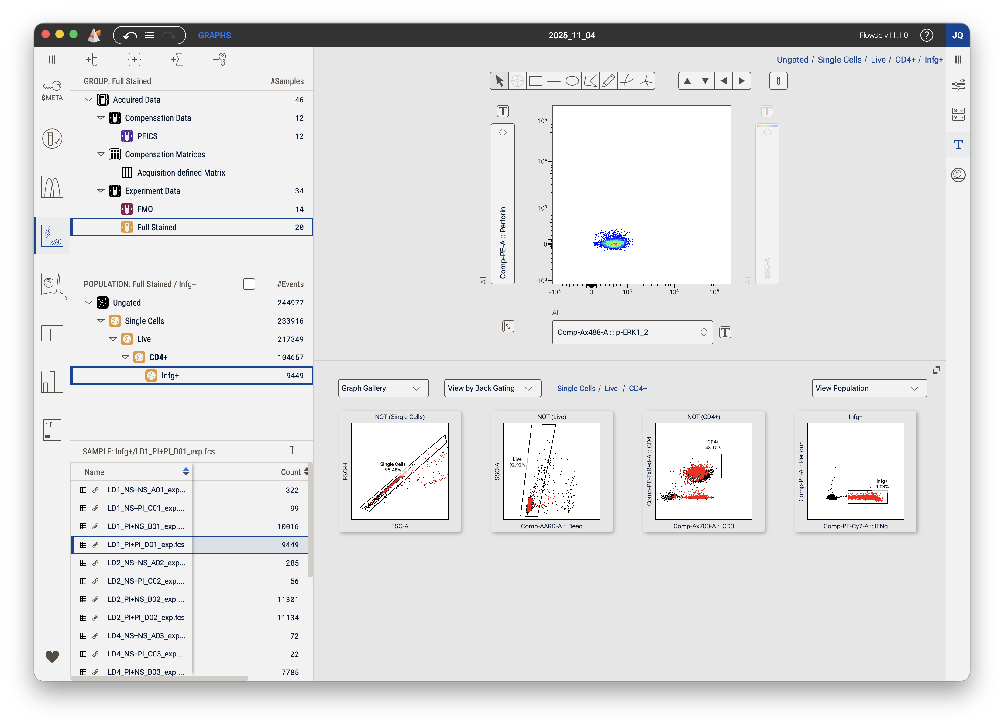
Figure 6. View by Backgating
Population Selector
View Population
View Population aligns the contents of the graph gallery with the primary graph.
View Active Gate
View Population aligns the contents of the graph gallery with a selected gate. If a gate is selected the graph gallery will show the contents of that gate. If no gate is selected the display will revert to the entire population.
View Target Population
View target population allows you to select a specific population to view in the graph gallery. When this option is first selected a target box will appear with the message 'Drag target population here', as shown in Figure 7. Dragging a population from the hierarchy sets the target population which is annotated with a target symbol as shown in Figure 8. The target population can be changed simply by dragging a different population into the graph gallery.
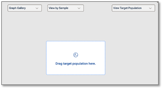
Figure 7. Drag Target Population
Figure 7. CD4+ T-cells have been selected as the target population
Target populations can be used in combination with any of the Gallery plot modes. Specifically, organized by plot mode the function is:
View by Sample: Shows a specific population for all samples. You can move gates in the primary graph and see how it impacts a selected downstream population. The parameters displayed will be the last viewed parameters for the selected population.
View by Parameter: Shows all parameters in the currently selected parameter set for a specific population for for a specific sample. Gates can be adjusted in the primary graph and see how it impacts a downstream population across many parameters.
View by Ancestry: Target population is used to select the terminal population in View Ancestry mode. The parameters displayed will match the parameters used to create the gates in the ancestry.
View by Backgating: Target population is used to select the terminal population in Backgating mode.The parameters displayed will match the parameters used to create the gates in the backgate analysis.