
The comparison properties controls statistical comparisons
The comparison properties are the bottom control in the properties panel (Figure 1).
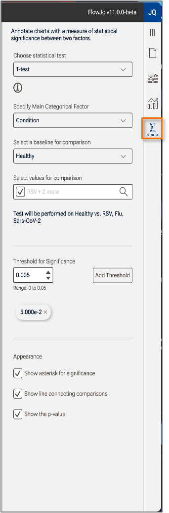
Figure 1. Chart Comparison Properties
Statistical test
There are two options for which statistical test to use:
- T-test: A classic parametric test in which the mean and standard deviation of two populations that are assumed to be normally distributed are compared to evaluate if they are statistically different, given a defined threshold.
- Wilcoxin Rank-Sum: A non-parametric test (a test that does not assume any particular distribution) in which the values are ordered and the data are evaluated for significant difference based on the probability of the ordering occurring, and a defined threshold.
Main categorical factor
The main categorical factor is a keyword that specifies what will be compared. Observe in the example below that Condition has been selected as the main categorical factor and all comparisons will be made between the baseline value of the Condition keyword (Healthy), and the rest of the values (Flu, RSV, Sars-Cov-2) (Figure 2).
Baseline for comparison
Identifies which value of the main categorical factor all comparisons will be made against. In the example below, Healthy has been selected as the baseline, so all comparisons are made vs. Healthy. Observe that the bars showing the comparisons all stem from Healthy (Figure 2).
Values for comparison
This portion of the panel gives you the opportunity to exclude some of the values of the selected main categorical factor. In the example below Sars-Cov-2, Flu, and RSV are listed with checks next to their entry. Clicking on a check will make the check disappear and remove the comparison (though not the bar in the chart) disappear. Note that Healthy is not listed among the choices as it has been selected as the baseline for comparison, and thus must be included in the comparisons (Figure 2).
Significance
Enter the desired threshold for significance as determined by your experimental design. The Add Threshold button can be used to designate additional level of significance that if 'Show asterisk for significance' is turned on, will show additional stars as additional thresholds are surpassed.
Appearance
Three options for controlling the appearance of the comparisons are available, and all are turned on below:
- Show asterisk for significance displays an asterisk on the plot for any comparison that is below the significance threshold you entered.
- Show line connecting comparisons draws a line between the conditions being compared to make it explicit which comparisons the p-values and asterisks refer to. In this example, all of the lines emanate from Healthy since that Condition value was selected as the baseline for comparison (Figure 2).
- Show the p-value displays the probability of observing a result at least as extreme as the observed result.
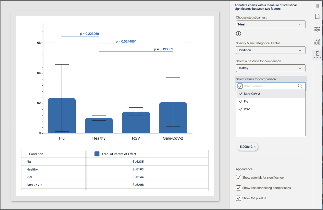
Figure 2. Example of comparison selections.