
The definitions properties panel contains tools to define what factors will be used in a chart.
The Definition properties are the primary table constructor. The top portion of this properties display defines what data will be used and how it will be oriented: a drop down for source table, choices to set the Primary Axis Content (the x-axis is the primary axis) to represent categories or numeric values, as well as the ability to group table selections based on a category (Figure 1).
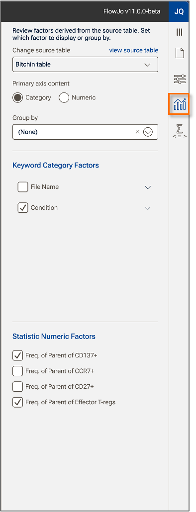
Figure 1. Definition properties panel
Source Table
The source table points to an existing table and determines what factors can be used in the chart.
Primary axis content
Figure 2 shows the effect of switching the primary axis from category to numeric. In the example below, there is one categoric factor in the data called Condition, which includes the values Flu, Healthy, RSV, and Sars-CoV2. There are two statistics chosen for display, frequency of two different populations. Choosing to display the category on the x-axis arranges the data so that each category is annotated on the x-axis, with color used to differentiate the pair of selected statistics (Figure 2a). In the same example, when the primary axis content is set to Numeric, the same data is arranged by number, where the annotation lists the two frequencies and different colors are used to indicate the categories (Figure 2b).
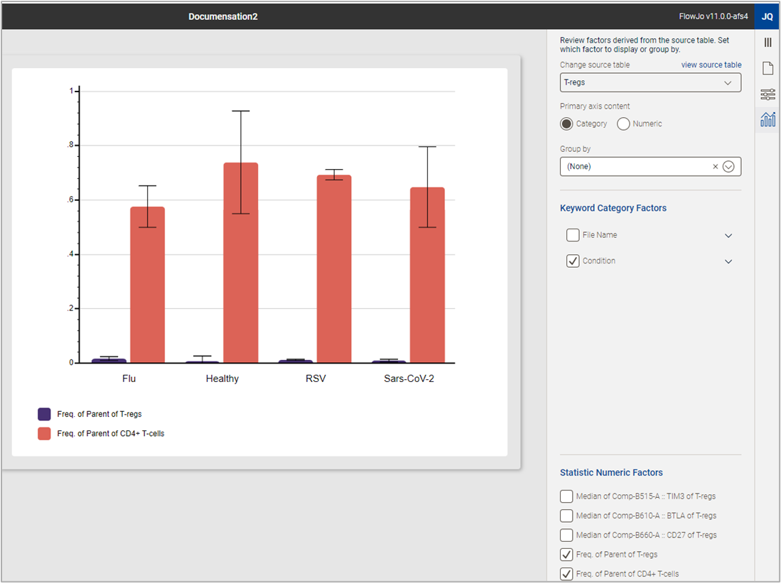
(a)
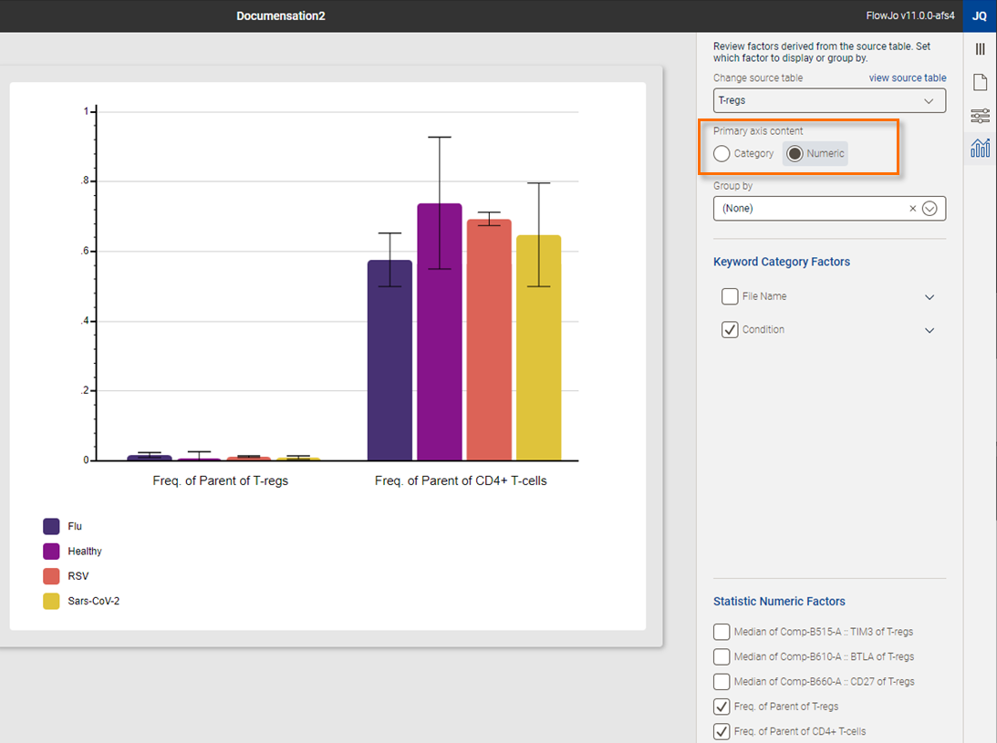
(b)
Figure 2. (a) Data displayed with a category on the x-axis. (b) The same data with numeric information displayed on the x-axis.
Group by
Group by allows you to structure your data into multiple charts organized by either category or a numeric factor as defined by the primary axis selection. The Group by feature can been activated by a selection from the drop-down menu. In the example below, the primary axis is numeric and separate charts have been created for the two frequencies (Statistics) (Figure 3).
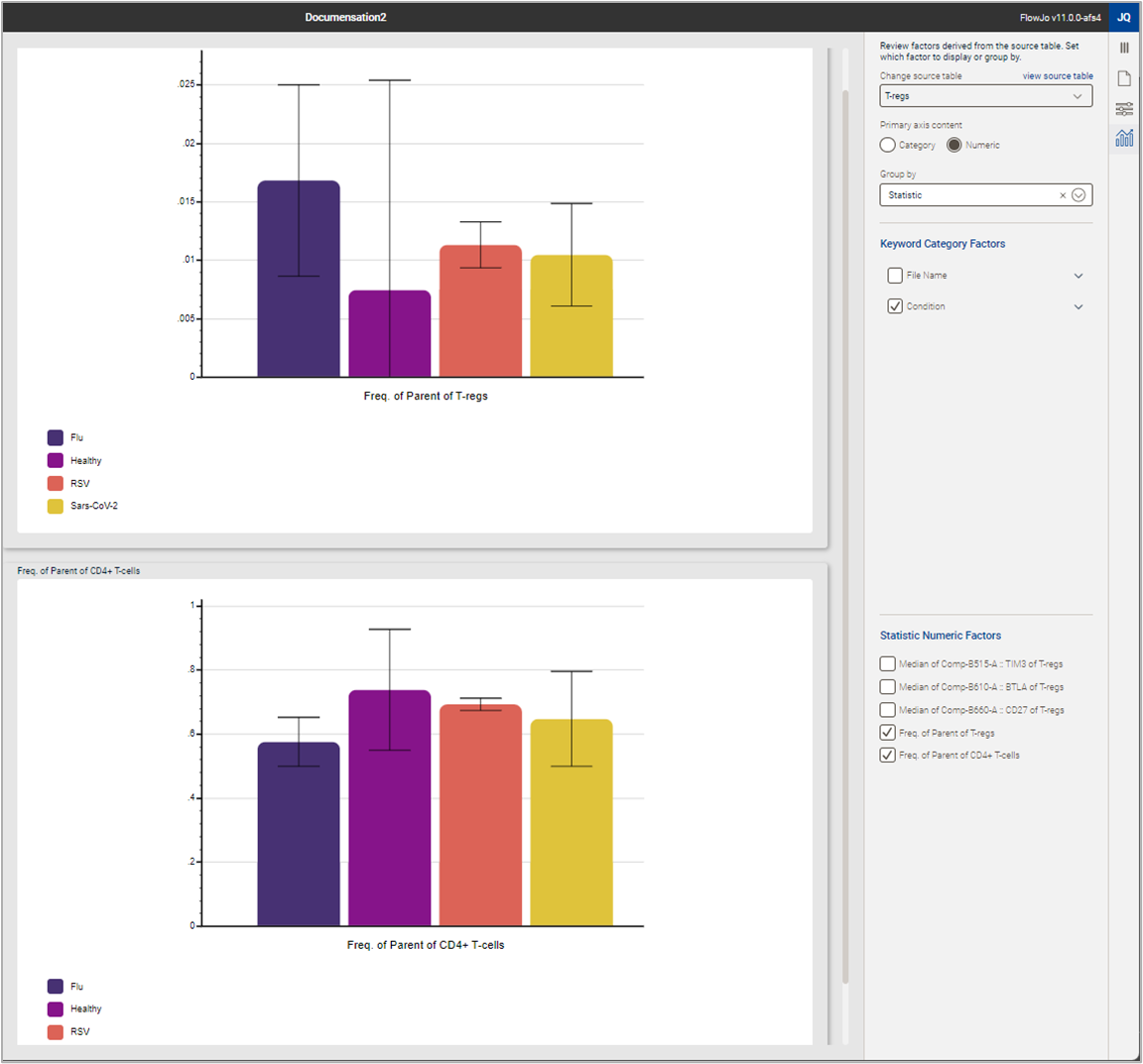
Figure 3. Grouping charts
Keyword Category Factors
This tool allows you to quickly reformat the chart to include any categorical data included in the original table used to generate the chart.In the example below, a menu with the values of Condition expanded via the carrot on the right side of the menu is shown (Figure 4). Checking off any one value of a category removes it from a table, checking an entire factor off removes all values from the chart. Selecting more than one categorical factor creates all Boolean combinations of those factors in your chart.
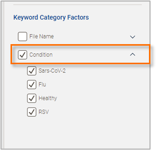
Figure 4. Keyword Category Factors
Statistic Numeric Factors
Just like the category controls, adding or removing a specific statistic from a table is as easy as checking the box. Below you can see the effect of turning off the two frequencies and turning on the medians (Figure 5). Three checks and the chart can display an entirely distinct set of information.
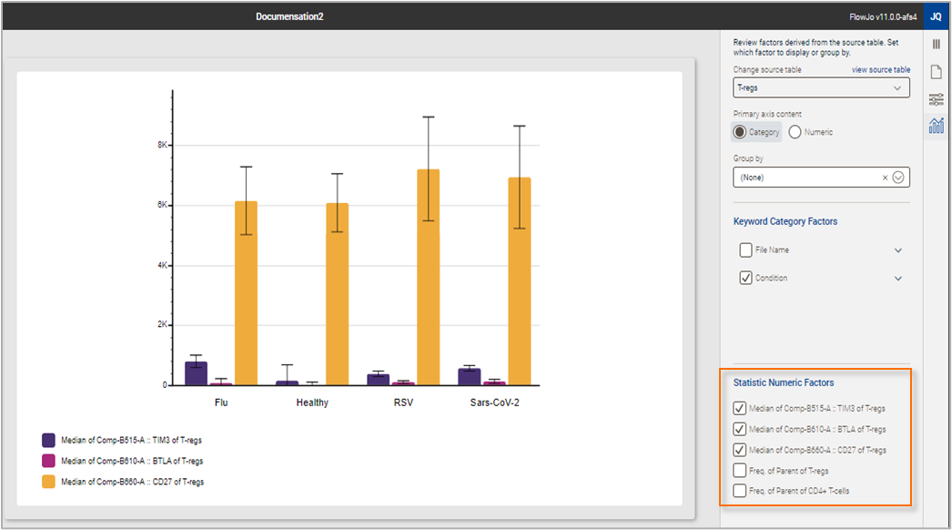
Figure 5. Statistic Numeric Factors