
The settings properties panel controls the appearance of charts
The settings properties are the third selection within the charts properties panel as shown in Figure 1.
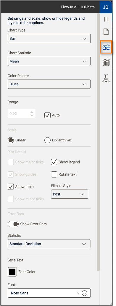
Figure 1. Chart settings properties.
Chart type
The primary choice is the Chart Type. To change chart type, click on the Chart Type selector (Figure 2) and make a selection. When choosing a type consider the strength of each type:
Bar charts are good for demonstrating magnitudes and can handle multiple categories and multiple measures, for example frequencies of many different populations across multiple time points. In one bar chart it is best to use a single statistic. Mixing statistics with vastly different ranges (i.e. percentages and MFIs) will tend to devalue some statistics.
Pie charts are good for representing results as a fraction of some whole. Multiple pie charts are needed for multiple categories or populations.
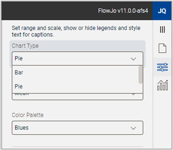
Figure 2. Chart Type selector
Chart Statistic
The chart static choice defines how the columns of data from your table are summarized as a single number in the chart you are creating. Columns in the basis table could be frequencies, MFIs, counts, CVs, etc. from many samples. The number that gets displayed in the chart will either be a mean, sum, or count of these values. The most common selection is mean, which will show an average value of the samples in the table and is invariant to the number of samples per category. For example, if you have 10 healthy samples and 5 samples from donors with a disease, a mean value will show the central tendency of each category without healthy samples dominating the data because there are more. Sums are useful if the total of all values per category is important to answer the biological question you are asking. Count will display the number of measures per category.
Color Palette
The color palette allows you to select a suite of colors that will be applied automatically across categories.
NOTE: As shown in Figure 3, only a single color is needed for differentiation across one category. The lefthand figure shows one statistic displayed across various values of one category. The righthand figure shows multiple colors in use from the selected palette when multiple statistics are selected.
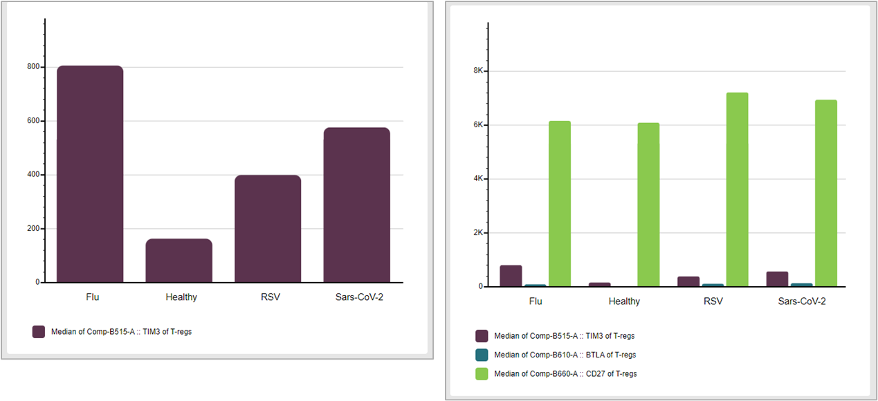
Figure 3. Color palettes applied to one or more factors
Formatting options
Formatting option include:
- The ability to fix the range to a user specified number or allow for auto-scaling. Auto-scaling is the default.
- Set the scale to be linear or logarithmic. Log scales can be useful for displaying mean MFIs.
- Set the plot details, such as showing or hiding major/minor tick marks, guides, or the axis numbers.
Error Bars
You can display error bars based either on the standard error or the standard deviation.
- Standard deviation is a measure of how disperse data is relative to the mean. The statistic is calculated as the sum of the differences of each data point from the mean, squared to eliminate negatives, divided by the number of samples, and rooted.
- Standard error is the standard deviation divided by the square root of the number of samples. Standard error indicates how different the population mean is likely to be from a sample mean.